The Commonwealth at 70:
From Westminster to the World
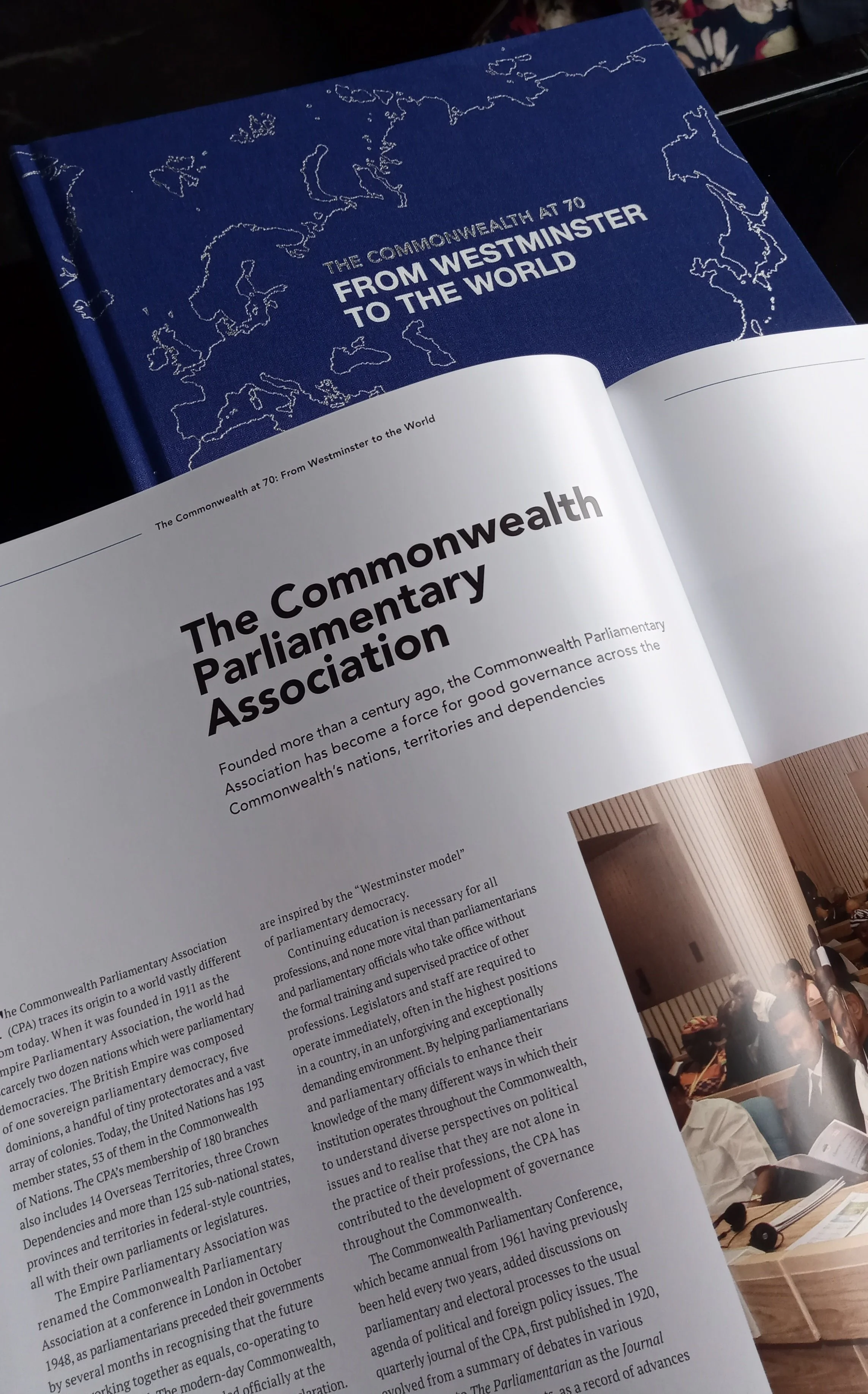
The signing of the London Declaration in 1949 heralded the birth of the Commonwealth of Nations. Exploring the build-up to this major moment in modern history and the Commonwealth’s development and influence over the past seven decades, The Commonwealth at 70: From Westminster to the World is a thought-provoking and beautifully designed hardback book.
PROJECT WORK
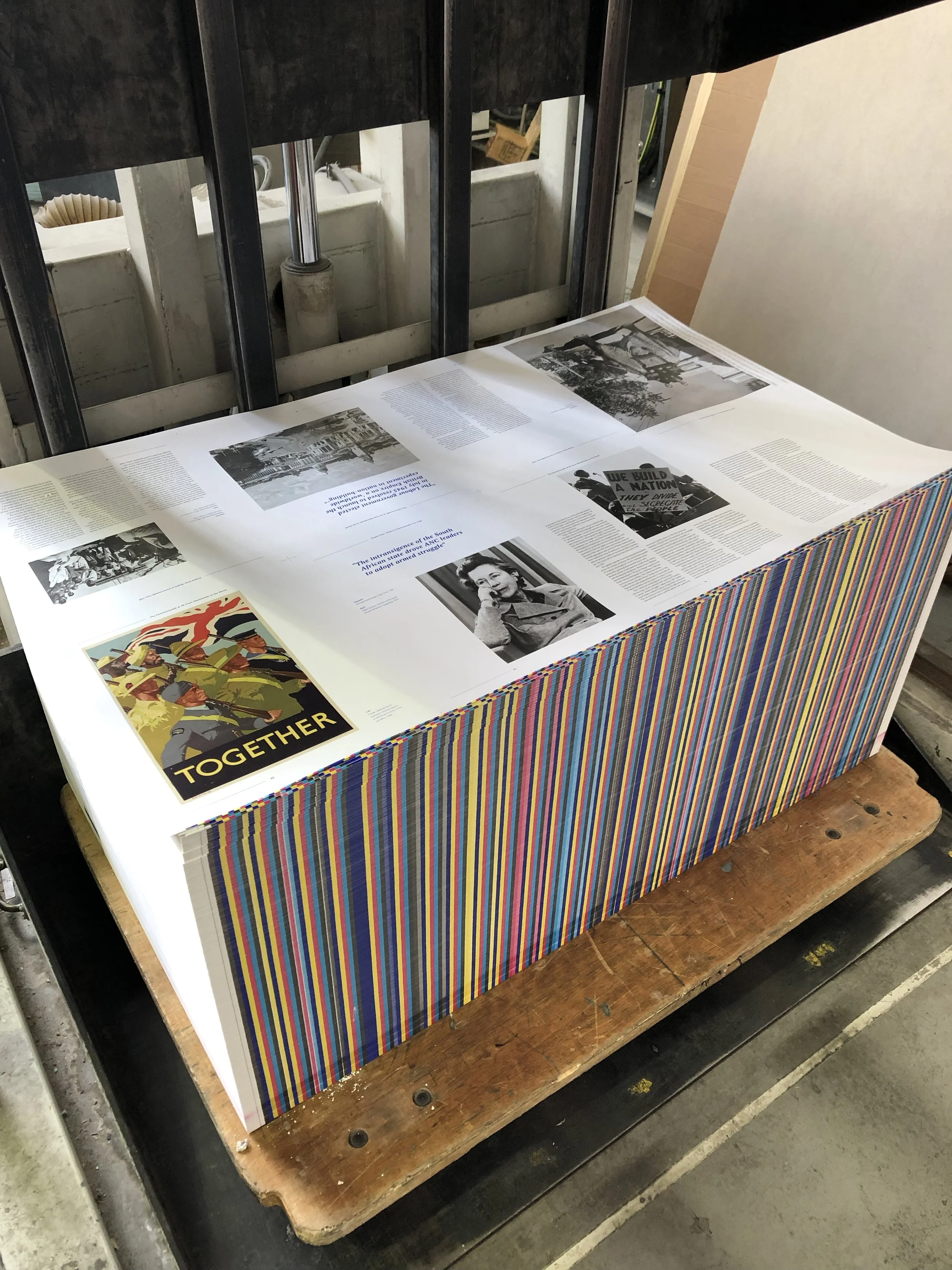
Design work included cover and editorial design, page layout, typographic system and template creation, selecting unique materiality such as papers, cover finishes and special Pantone colours, and attending the press pass at the printers.
Book launch wwas held at the Westminster Abbey cloisters to celebrate the official release together with the History of Parliament Trust.
Printed by GavinMartin; Credit: Head of Design – Aniela Gil
CONCEPT & CONSIDERATIONS
Apart from creating overarching concepts and themes for the publication, it was always important to create an elevated but considered typographic system. It had to function across 400+ pages with content ranging from 16-page editorial historic features to paid-for advertising content that was uniquely created in the style of the publication. It was key to create adaptable systems that look consistent, but be flexible enough to work with varying editorial content.
For the typographic system, we used a modern sans-serif font for headlines , subheadings and page furniture. For body copy, pull-out quotes and captions we used a traditional serif font to allow for a more ‘historic’ feel and touch for the publication.
We decided to utilise White and Silver foiling on blue cloth for the cover, and a special Pantone Blue throughout the publication. Additionally a special presentation case was created using a special Pantone Metallic Silver and Blue to create an “inverted” version of the cover design.


