Conrad Group
Conrad Group is a respected brand in the marketing services industry, specialising in travel, tourism, and hospitality. Since its founding in 1988, the family-owned company has thrived on adaptability and a forward-thinking approach, growing through organic expansion and strategic acquisitions. With over 36 years of experience, Conrad Group is committed to fostering success for clients and stakeholders.
Fable&Co. embarked on a mission to revitalise Conrad’s brand identity, aiming to better reflect its established reputation, creative approach, and growth ambitions.
I got involved freelance brand designer, working closely with Fable&Co’s Creative Director, developing creative concepts, the brand identity, logo and website design.
The new identity was designed to uphold the company’s core values of trust and results-driven operations while highlighting its commitment to innovation. By blending a history of success with a modern, visual aesthetic, the rebrand aims to appeal to both new and existing audiences. The new branding positions Conrad as a modern, dynamic entity ready to tackle future challenges. Its new identity expresses confidence, creativity, and integrity, attracting potential partners, clients, and acquisition prospects.
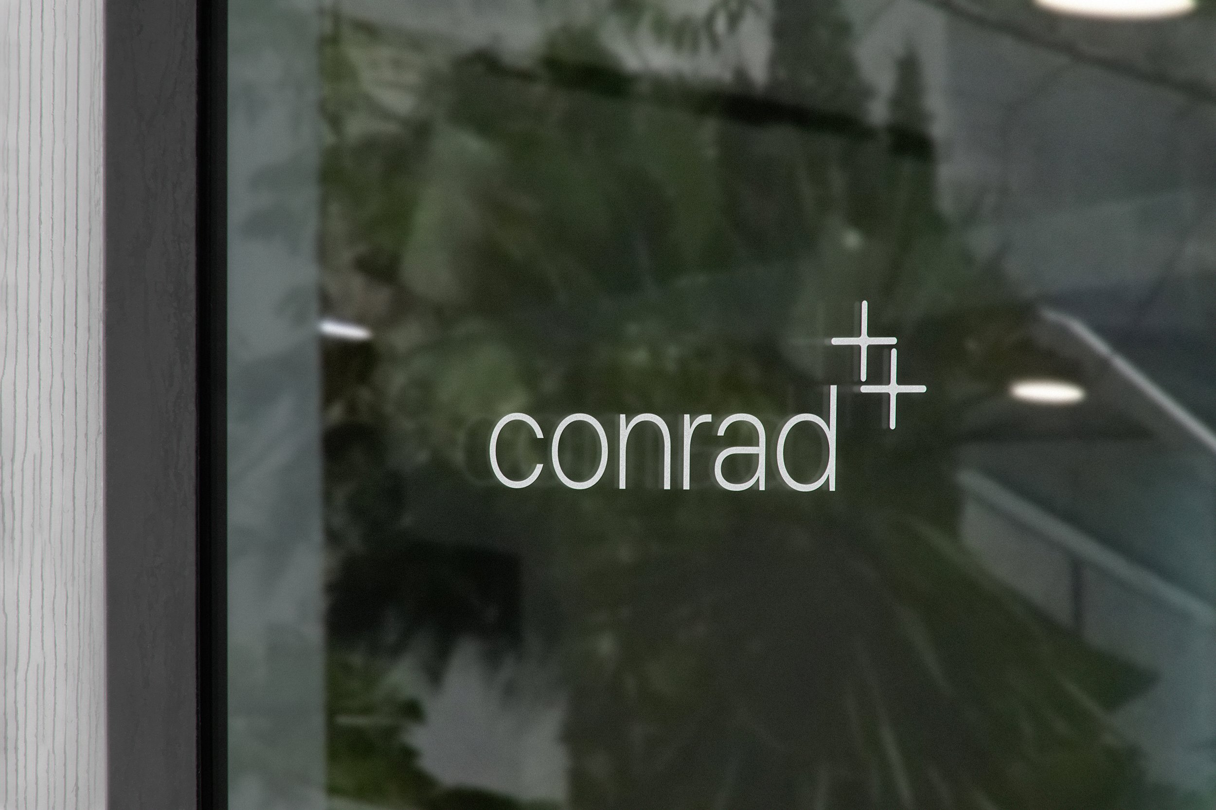
Conrad’s logo has been reimagined with a modern, clean typeface and subtle geometric elements. The “+” symbol represents the company’s dedication to growth as well as partnership, serving as a visual metaphor for its strategy of fostering symbiotic relationships with clients and acquired businesses. Subtle elements like the C and O have been adjusted to allow for a consistent feeling.
The colour palette features neutral tones, primarily soft beiges and greys to convey professionalism and stability, while a cool blue is used for minimal highlights.
The general brand visuals showcase minimalistic layouts characterised by high-contrast design combined with sharp lines. Utilising imagery of key team members adds a personal touch, emphasising Conrad’s approachable nature. This clean aesthetic not only inspires confidence but also effectively communicates the brand’s core values in a clear and concise manner. Overall, the rebranding reflects a commitment to modernity while maintaining the essence of the company’s identity.
With a sophisticated and functional layout, the website highlights Conrad’s expertise in travel, tourism, and hospitality marketing. The design blends the modern monochrome brand palette with subtle accent colours, enhancing clarity and user navigation.


