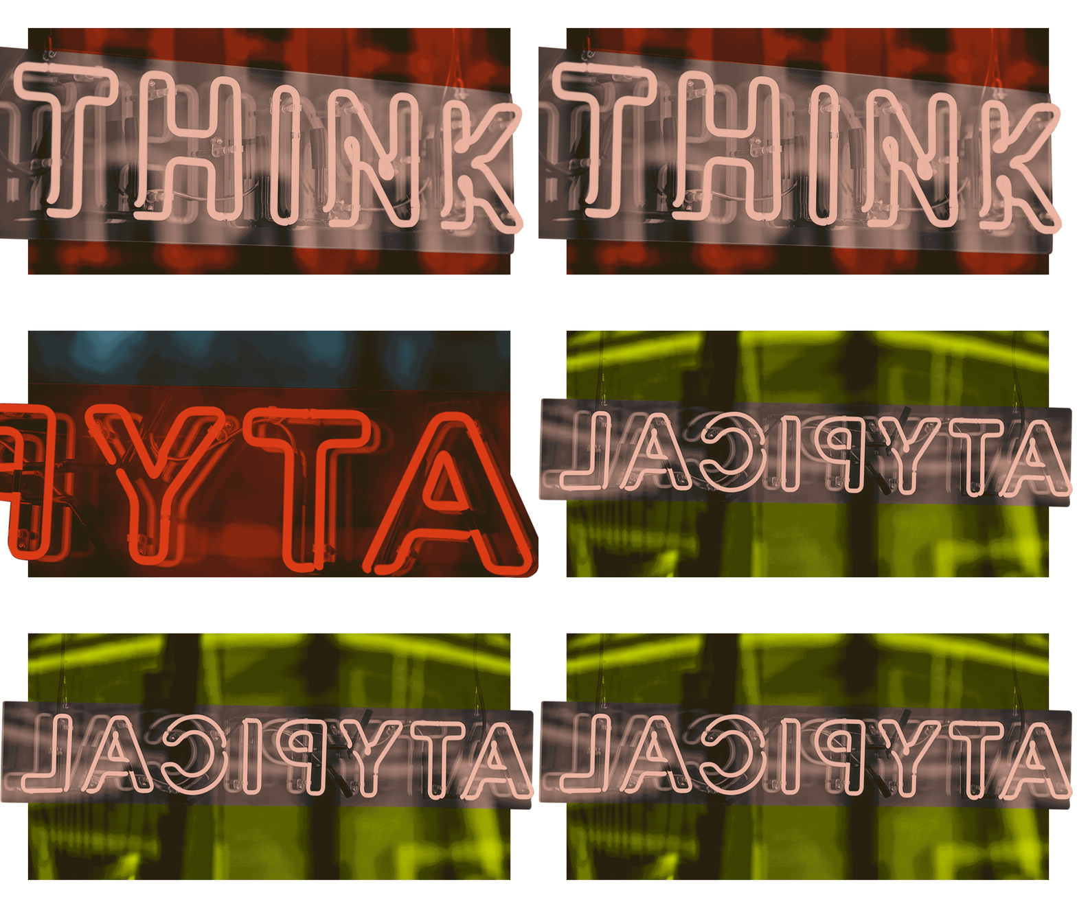
ATYPICAL PARTNER. art direction
Atypical Partner is a financial holding company housing a portfolio of innovative asset managers and gives them access to forward thinking investors and entrepreneurs. Investment strategies include Three Hills Capital Partners, THe IMPACT, PallMall Legacy and Sinclair Capital.
CHALLENGE
Atypical Partner has been established as umbrella company for a range of investment brands for several years, benefitting especially from the legacy of Three Hills Capital Partners. The challenge was to create a bolder, more unique voice and space for the Atypical brand by expanding on the brand ethos. This also included to strategically differentiate the brand from industry competitors, showcasing the atypical brand aspects, while developing a digital first approach for a new investment platform.
GOALS
Develop the brand organically to the next level.
Bring the investment world closer to the audience.
Solve with digital first approach for digital investment platform.
STRATEGY & CONCEPT
Within our tight knit internal team, we developed and executed a new Art Direction for Atypical, which expanded the previously existing brand identity. With the aid of an external verbal strategist, we developed a verbal strategy first build around the principle of bringing investment closer to the target audience.
Following the “invest closer” idea, we developed the overarching core concept of “breaking the frame”. Inspired by PopArt, we created layered, hyperrealistic collage visuals in combination with a bright colour palette.
In addition to a three-day photo shoot which was utilised for asset creation, we also worked on typographic styles, animations and video editing to update reports, publications and assets across all brand touch points.
Art Direction | Branding | Digital Design | Animation | Editorial Design
Credit: Chief Brand Officer: Elodie Sibony, Project Manager: Olivia Curle, Photography: Ben Pierre G, Videography: Daniel Peters
A personal touch bringing investment closer
In addition to the cut-out collage style and vibrant secondary colour palette, we introduced hand-crafted elements such as script typography, silkscreen textures and custom hand-drawn illustrations.
This bold approach goes hand-in-hand with Atypical’s ethos of tailored and crafted approach to investment, but also offers a flexible range of image making tools that can be adapted and organically grow over time.
A key aspect of developing the art direction was to keep the connection to the original brand design, which is nested within beautiful office spaces, modern sans serif typography and a minimal, soft colour palette.
To ensure the Art Direction connects the old and new elements, we conducted a 3-day office photo and video shoot to generate source material for asset creation. These would be utilised and re-purposed for collages, editorial layouts and brand touchpoints.


