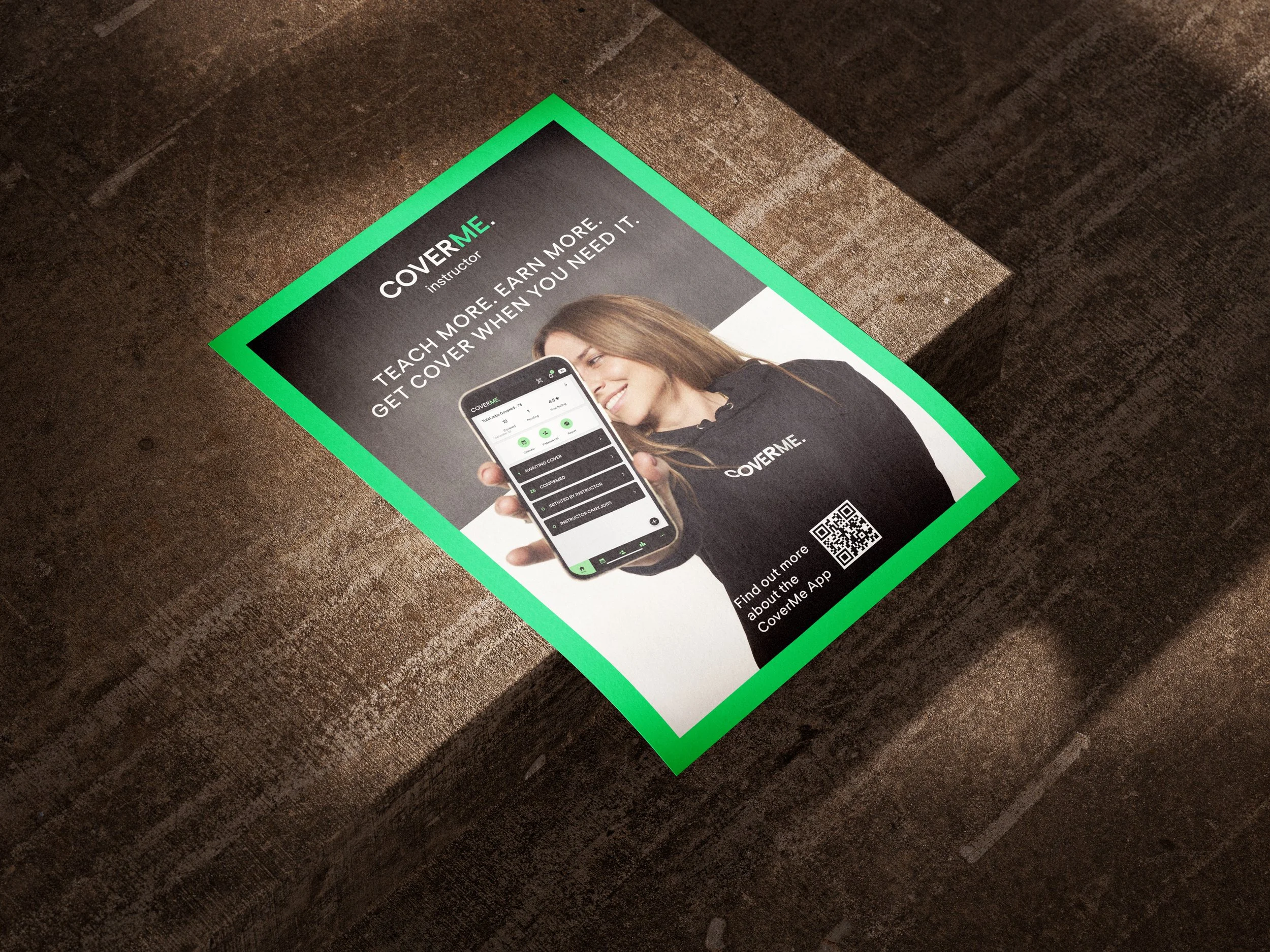
CoverMe. Fitness
CoverMe. is a fitness app that matches talented freelance instructors with inspirational studios, making sure that exciting group exercise classes happen – every time. Until now, securing cover has been time consuming. The CoverMe app frees up instructors and studio partners to deliver the very best group exercise classes.
CHALLENGE
“CoverMe. Fitness” is a new brand and start-up with a digital first service product. When I was approached for this project, the company’s branding only contained a logo lockup and brand colours, but required a full visual identity and art direction speaking to the two target audiences as well as attract investors.
Additionally, it was important to create an overarching concept that could be expanded across other sectors like healthcare or hospitality in a future expansion of CoverMe.
GOALS
Introduce the full brand to the world.
Elevate the brand and make it to stand out as a reliable, energetic and personal solution.
Communicate their mission and vision, and connect both audiences, fitness instructors and venues.
STRATEGY & CONCEPT
After researching competitors, speaking to the founders and creating mood boards, it became quickly clear that the key concept is the duality of two audiences and how they connect.
Through this I developed the overarching ‘split image’ concept for hero visuals and animations: a diverse range of instructor portraits, split in the centre with two different image treatments facing the viewer directly and slowly animated like a rolodex. This way, one visual represents the CoverMe. certified instructor (Blue/Green duotone) and the different unique venues across the UK (coloured image side).
Additionally a personal touch was created through hand-drawn elements like arrows, circles and mark making in combination with grainy image treatments to unify assets from different budget-friendly sources.
For the whole project, my work included Art Direction and visual brand strategy, website design, explainer video animations and visual social media strategy as well as brand guidelines and logo animations.
Art Direction | Branding | Web Design | Animation | Sound | Visual Social Media Strategy
Credit: Original logo mark and creative advisor – Elodie Sibony.
Explainer video animation for venues
The key functionality is about showcasing how simple and straight forward the brand’s app and services are.
This animation was specifically tailored and scripted towards venues as customers and is used on the CoverMe. website
Explainer video animation for instructors
This is the second explainer video to showcase key functionalities for the other target audience: instructors.
Like the venue video, it can be found on the CoverMe. website


